

Forum News
 Post
Post
XPPenOfficial
2026-10-20
1401
246
35
Community Topic: Show Us Your Creative Workflow! 🎨
Every artist has their own way of bringing an idea to life! Some find references on their phones, sketch on a tablet, and finish on a computer. Others prefer to create everything on one device. 💬 Let's Share & Help Each Other!1. Show Us Your Process 🎨Show us how you create, from your first sketch to the final piece. Feel free to use words, emojis, or both!For example:📱 Phone (references) → ✏️ Tablet (sketching) → 💻 Computer (editing) → 🎨 Finished artwork! 2. Share Your Tips & Challenges 💡Why do you prefer this setup? Have any tips for switching between devices, organizing references, or making your process smoother? If there's a step you find tricky, feel free to ask the community for advice! Let's share what works and help each other out. 🎁 Tiered RewardsWhen 30 creators join the discussion, we'll randomly select:🎨 1 winner — Deco 640🎉 5 winners — 300 X-Coins eachWhen we reach 80 creators, we'll add an extra prize:✨ 1 additional winner — Magic Pro 13 Note: Only comments with more than 30 words will be counted as valid entries. Reward milestones are based on the number of unique participants, not the total number of comments. 📅 Event Schedule (UTC+8)Discussion Period: October 20–26, 2026Winners Announcement: October 30, 2026✨ Less Switching, More Creating!Wish you could spend less time switching between devices and more time creating?Get ready for Magic Pro 13, launching on October 27! Draw independently or connect to your computer for a pen display experience. Its dual cameras let you capture inspiration, while Shelf helps you organize and access your references and artwork files.More flexibility for your creative journey. Less interruption, more inspiration! 💜


42
2
0
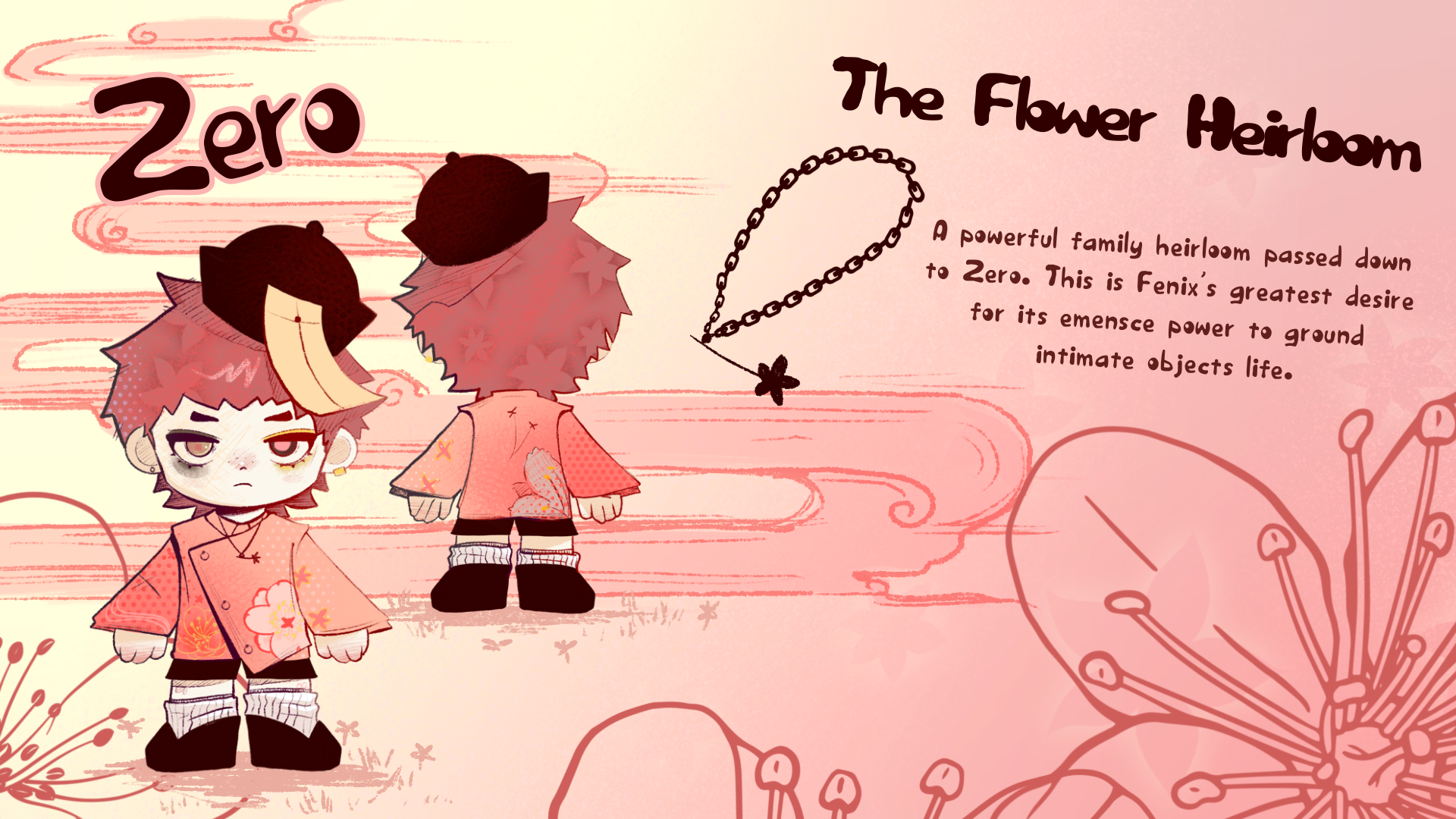
why did the sumbission deadline end early for the toy competition
the sumbission deadline stated 10am UTC +8 october 16th and i tried to sumbit my entry but the event ended and I could slected as my enrry sumbission. I put alot of hard worl and was only able to work on this last minute because I had a nursing interview I had to study for I really hope my submission counts because that would be really unfair!!
30
0
0
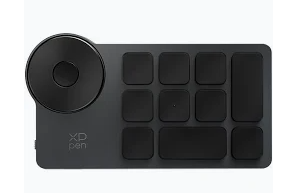
Using the Wireless shortcut remote
Hello,I purchased the wireless shortcut remote because Amazon Alexa said it would work with Blender. I cannot figure out how to configure it to work.Any links or info would be welcome. This device came with minimal instructions. If I can't get details on how to set it up I will return it.Thanks'
XPPenOfficial
2026-10-09192
6
3
Face Drawing Challenge | Winners Announced! 🎉
Our Face Drawing Challenge has officially wrapped up! A big thank you to everyone who joined in and shared artwork, practice pieces, and drawing tips with the community!We received 23 eligible posts, and 3 winners will receive 300 X-Coins each!🏆 Congratulations to our winners:metan Radwok Luna Art Stay tuned for more tutorials and fun challenges!

47
1
2
PLS HELP "Audit Not Passed"
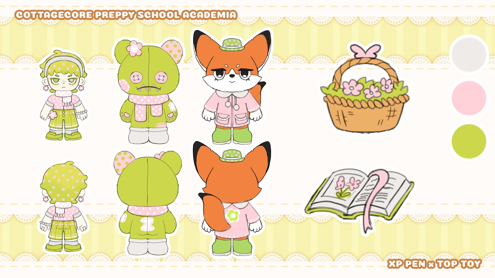
While uploading my entry for XP PEN x TOP TOY it got flagged as Audit Not Passed (it’s my 4th entry so I reread the guidelines and there’s no specific rule about the number of entries), I tried to upload again (with different files / sizes but I still cannot share my work) and I honestly don’t know if I should create a new account to post there or not?

70
2
0
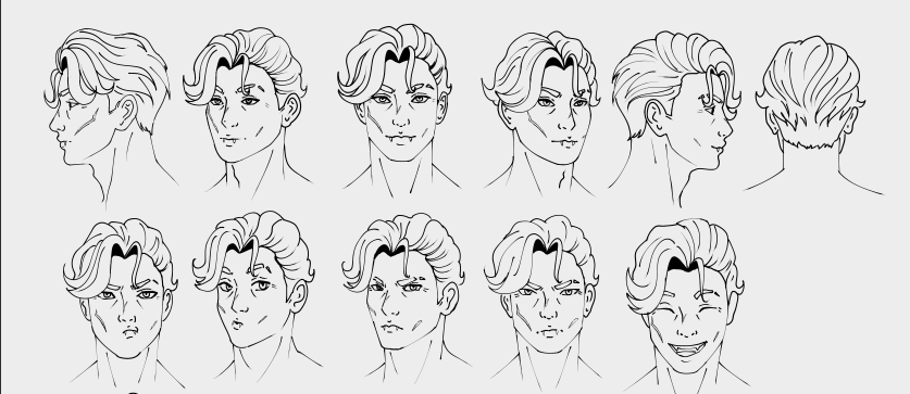
Five steps to rotating your character face how i did it and what i learnt #XPPenTutorialPractice.
#XPPenTutorialPracticeTips for keeping your character face rotations clean and consistent! when designing what i did 1. Start with the front viewI recommend beginning with a clear front view before moving on to the other angles. It gives you a reliable base for the proportions, facial features, hairstyle, and overall silhouette.2. Dont be afraid to use 3d models or any other reference 3D models can be really useful when you're struggling with an unfamiliar angle. I like using them to check the perspective and placement of the facial planes. They are especially helpful for side and 3/4 views, if your softaware allows it practice a bit with them or any other image reference that are 3d head models 3. Keep your landmarks in mindPick important landmarks that define your character: the width of the jaw, eye spacing, nose length, mouth position, ears, hairline, etc. this will help get the overall shape of your character and having them in mind will help you notice when you're drawing something different from what your character actually looks like! 4. Flip your canvas!Flipping the drawing horizontally is a simple way to catch proportion and construction mistakes that your brain has gotten used to seeing.What i shoul've done2. Use guide lines!Before drawing the features, establish the construction of the head: the center line, brow line, eye line, jaw, and other landmarks that we talked about before, in my case i did it with the face structure! but that is NOT everything you have to keep in mind, you also have to keep in mind your hair, accesories, and other things and use guidelines for those tooThat's all!

83
2
0
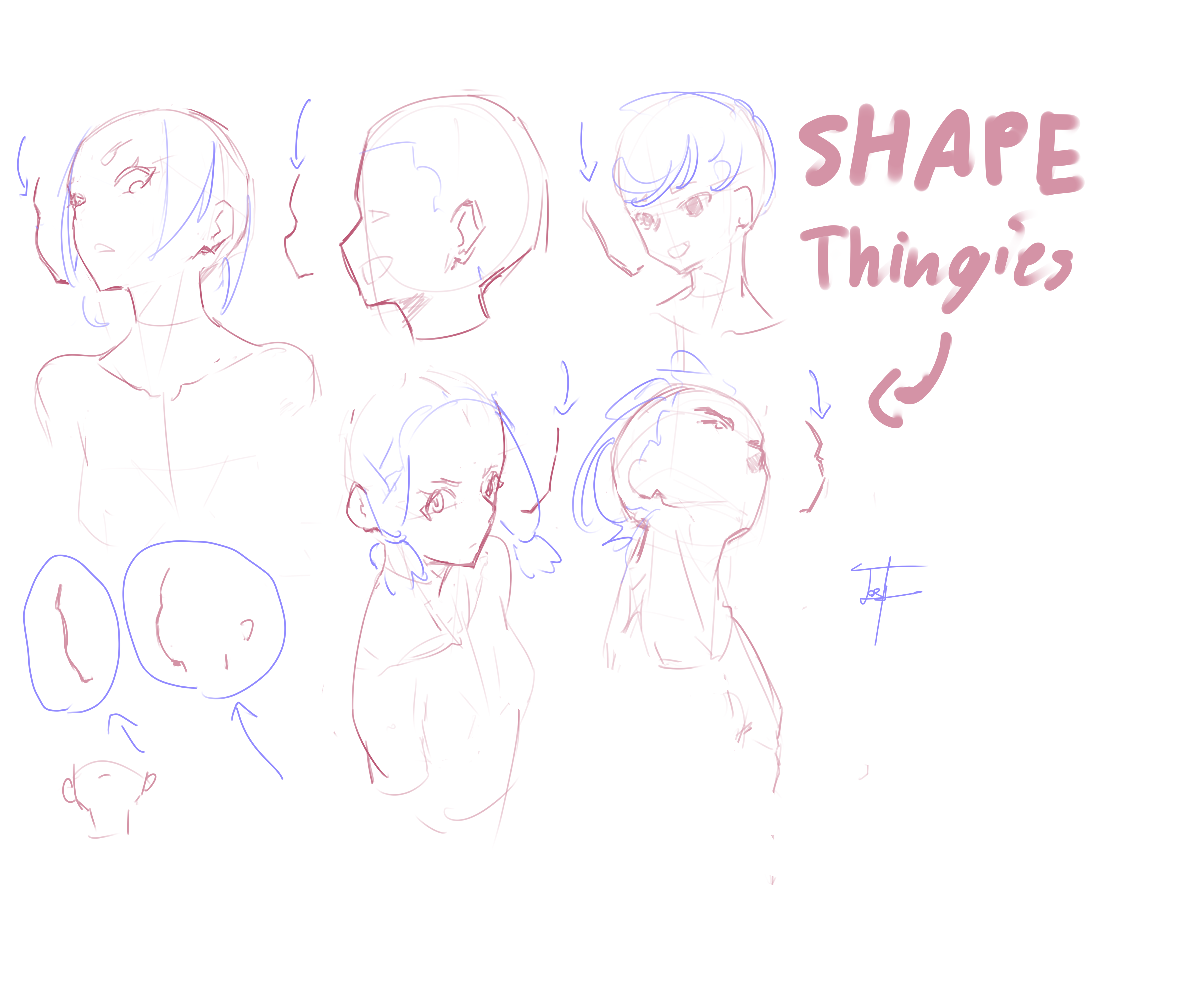
How to ANGLES
My tip to make face angles easier is learning what I call the "shape thingies". At every angle the face part will make a certain shape or form. Sitting down to draw these for fun can add to your head studies by teaching you your prefered result and what style of face you want to draw with the shape thingies. This is something to add-on to your head and face studies that's low effort:)
89
1
0
Xp pen drawing content tip and artwork
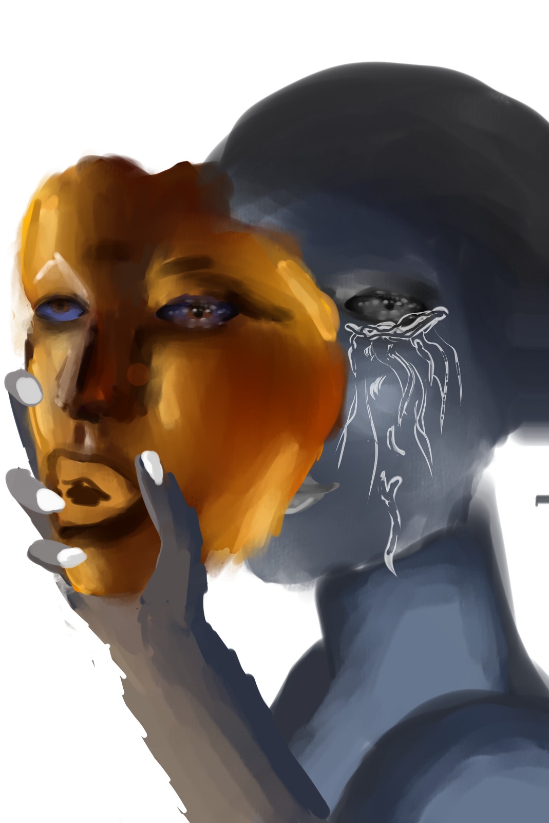
One thing that really helped me while working on this piece was thinking about the face as different planes. I start by figuring out where the light is coming from, then I look at which parts of the face face toward or away from it. That helps me decide where to put lighter and darker values instead of randomly adding shadows. I practiced this idea while painting this piece, especially around the cheeks, nose and eyes. I'm a 13 year old artist, and getting an XP-Pen tablet has been a dream of mine. My family has to be careful with money, so having the opportunity to participate in an XP-Pen challenge like this means a lot to me.

CrisXuhDraws
2026-09-30
108
2
4
Artist 12 3rd gen - Review
WHAT'S IN THE BOX?From the moment I opened the box, I was surprised by how neatly everything was stored and organized. If I put the tablet back in its box, it would be so much easier! And the fact that it came with a stand was a delightful surprise.THE TABLETCompared to the Artist 12 2nd gen, it’s smaller but in a good way. The borders are narrower: This gives the screen where you draw more visibility and reduces the space between the keys, making them easier to access.The keys and X-Dial: They’re slightly smaller, but thanks to that and the previous point, you get two extra dials! They’re small, but for me, they’re easier to control. They’re perfect for quickly adjusting the zoom, rotation, or pen thickness, depending on your preference.This has really helped me reduce my reliance on the keyboard and stay focused on drawing, since I can easily access the shortcuts I use most often.Lighter Weight:In addition to the borders, the tablet is thinner, which makes it lighter. The first time I took it out of the box, I was surprised by how light it was. That’s why I can handle and move it more easily.Screen:Its paper-like texture makes it feel quite pleasant when drawing; you no longer feel like you’re drawing directly on a screen. Goodbye, scratches and glare! Thanks to the screen’s construction, it’s anti-glare and scratch-resistant. So far, I haven’t gotten a single scratch, and I can draw with the lights on without any annoying glare.Screen Colors: From the very first time I turned it on, I liked how vivid the colors looked and how similar they were to my computer screen, so I didn’t have to adjust anything in the driver. This is a feature similar to the Artist 24 Pro that I loved.Brightness:The only issue is that the buttons to control the tablet’s brightness can malfunction, so to lower it, you’ll have to do it manually through the driver.THE STYLUSIt’s a little thinner and lighter than its predecessor, the Artista 12 2nd gen. Its strokes feel quite light thanks to its x4 chip and 16,384 pressure levels.You can barely feel the tip moving: As someone who has used various tablets, this was something I noticed right awayIt’s just like drawing with a pencil!And best of all, it’s magnetic! Now I keep the pen in one place, where it’s easy to grab when Ineed it.PORTABLE STANDIt’s quite sturdy thanks to its aluminum construction and super easy to set up or put away. However, due to its size and design, I can’t use it on my desk.Nevertheless, there’s no doubt that it’s a great tool.COMMENTSThe transition from the 2nd to the 3rd version was a major innovation. It features quite a few changes and improvements that have made it my primary drawing tool when using my computer. It’s super comfortable and looks much better.


289
1
2
Female Faces and Natural Skin Rendering (XppenTutorialPractice Entry)
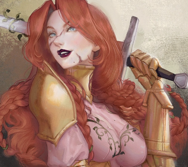
Hi everyone! This is my second submission for #XPPenTutorialPractice, and I'm sharing a step-by-step breakdown of a commission! This character belongs to my client, and honestly, I fell in love with her delicate face and soft color palette the moment I got the brief. It was the perfect excuse to dig deeper into natural, skin rendering focusing on female portraits and how to balance contrast and color temperature to guide the viewer's eye.The Rough SketchBefore locking in a final pose, I always run through a handful of rough sketches. It loosens you up and gets you comfortable with the character's facial structure before you commit. An idea rarely looks the way you imagined it in your head, it only really reveals its potential once it's actually sitting on the canvas in front of you.Tip: Don't fall in love with your first sketch. Even if it looks fine, force yourself to try 2-3 quick variations of the angle or expression. sometimes the first idea isn't the strongest one, and you won't know until you compare them side by side.Color Blocking (The Blueprint)Once the sketch feels solid, I block in base colors using Multiply and Soft Light layers to establish volume early. Light and shadow are the backbone of the whole piece. This secondary "color sketch" works like a blueprint that everything else gets built on top of.Tip: keep your shadows in clean, bold blocks at this stage, don't blend anything yet! And while high contrast with sharp shadow shapes tends to work great for masculine faces, female portraits usually benefit from softer, warmer, and more gradual transitions. In this piece, I pushed the heaviest dark values into the neck and hair on purpose. Framing her pale eyes and skin with that darker surrounding value pulls the viewer's eye straight to her face.Tip: If you're not sure where to place your darkest darks, ask yourself: where is it hardest for light to reach? Look for areas under strands of hair, between the neck and collar, or where two overlapping forms touch. This is called Ambient Occlusion. While lineart simplifies these contacts into solid lines, real life doesn't have outlines, so in lineless rendering, we use ambient occlusion to ground the forms and create realistic depth. Even if your rendering is soft, don't be afraid to use dark shades in moderation.Skin and FeaturesMy goal here was to paint a fierce warrior with a soft and delicate face, so I deliberately avoided heavy skin textures. I used a low-opacity airbrush to slowly build up the subtle volumes of the cheeks, eye sockets, and nose bridge. Lots of thin passes rather than one strong one. Instead of finishing one feature at a time, I worked on the skin, eyes, eyebrows, and lips all together, going back and forth between them.Tip: This is the part where we’re tempted to zoom in and lock in one feature, but hold your brushes! Rendering the eyes, lips, or nose in isolation before the overall details are established will throw off the harmony of the whole face. Keep working all features together in broad, soft passes first." Keep everything at roughly the same "finish level" as you go, and only push into final detail once the whole face is balanced.Color RelativityColors are relative! A color only reads as "warm" or "cool," "light" or "dark," in relation to what's next to it. To keep my values making sense, I use a simple value-check trick: a temporary layer on top, set to Color blending mode, filled with pure black. That flattens the whole canvas into grayscale instantly, so I can catch any weak or muddy areas before I go further.Once the values are locked in, I shift focus to skin temperature to make the face feel alive rather than flat: cheeks and nose lean warm and rosy, while subtle cool undertones (desaturated blues or greens) sit in the shadow zones for a bit of realistic depth.Tip: Try doing color studies from real photo references and use the color picker tool directly on people's skin. you'll be amazed by how much green, blue, and yellow actually exist in human skin tones! Real skin is never just one flat shade of peach or brown.Tip: A cheap trick that works almost every time, if your skin still looks flat after values and temperature are both handled, try adding a very faint complementary color into the core shadow (like a touch of green-blue under warm skin). It's subtle, but it's often the missing 5% that makes skin read as "alive" instead of "painted."Final Polish and EdgesWhile I relied heavily on soft and lost edges to convey the delicate skin of this character, I strategically incorporated hard edges to create contrast and give the piece a finished, polished look, such as the sharp boundary where the hair meets the cheek, the eyelashes, and the crisp outline of her lipstick.Tip: Just like colors, edges are relative!! A soft edge appears even softer when placed next to a hard edge, and a soft edge can look quite crisp if it's sitting next to a lost edge. I used this principle strategically to enhance the softness of her face: pairing the soft, lost edge of her cheek's form with the sharp, hard edge of the hair strands right beside it makes her skin look incredibly smooth.Tip: Save your highlights for last, always. A single, confident highlight placed on already-finished skin reads way stronger than ten scattered highlights added too early. Finally, I wrap up with crisp highlights, pupil details, and a few loose strands of hair overlapping her face to add depth and charm. The final stage always goes fast if everything before it is solid.Hope these tips on the sketch, values, color temperature, and edges help with your own portrait studies! Rendering soft, natural skin is all about restraint and patience. Knowing when not to add detail is half the battle. Thanks so much to XPPen for running this challenge, it's been a genuinely great excuse to slow down and break down my own process instead of just painting on autopilot.
Total 2667
- 1
- 2
- 3
- 4
- 5
- 6
- 134