


Day one we are using XPPen Community Tutorials EP.1
first some notes on what was covered here and my personal experience + material i use for each stage of our illustration
1. Composition & Overall Structure
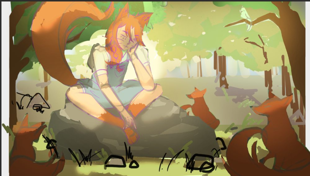
A strong painting starts with a strong composition that guides the viewer's eye and builds depth, let's start from big to small!
the video covered:
- Use of big shapes first! ignore details until the structure is clear.
- Split the scene into three planes: foreground, midground, background, this helps us built depth in our work, each one of this planes has importance Foreground frames the shot and adds depth, Midground holds the main action, Background creates atmosphere and environmental context.
- In this stage we pick or focal points and decide how we are going to make our viewers eyes land there
For this stage some useful guides, tutorials and things to study i used are:
Gartzia Artz composition videos, this are GOLD for composition:
please note this videos are in Spanish, for English speakers some other great videos I've seen are:
Now how i approach this stage?
something that the video does not say but i personally love to do is make at least 4 thumbnails and pick the idea that best represents what i want to create, and the composition i feel like doing more
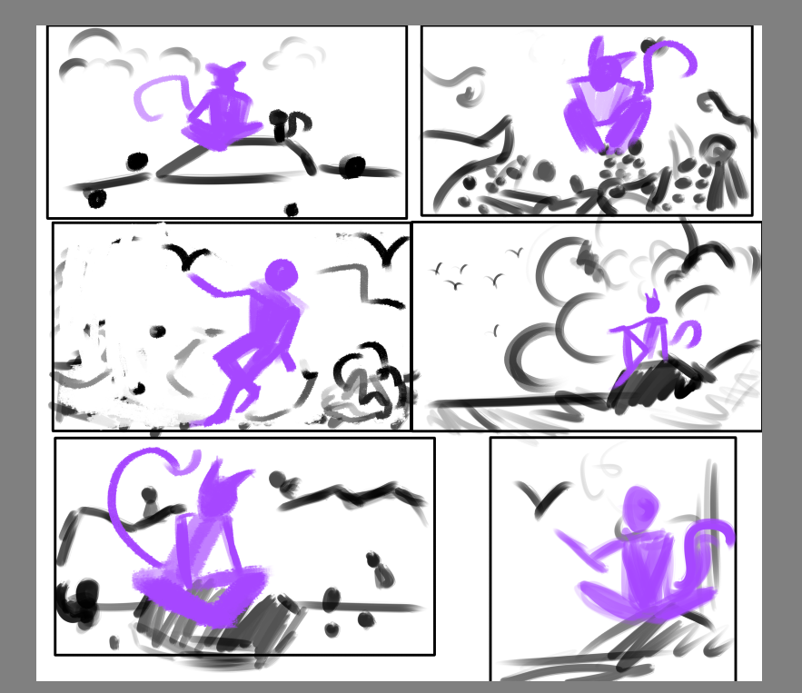
it is then that i pick my favorite and start working on the composition
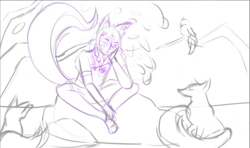
2. Characters & Visual Narrative
We need the characters to express emotions and actions so we can communicate a story
- Posture, direction, and spacing between characters affect naturalness and emotional connection, nonverbal communication is a thing! we can read emotions in our bodies
- Simple, clear silhouettes read better than over-detailed figures in early stages, this helps us have the things we need clear, if it works on silhouette it will work on the final, if our silhouettes are lacking no rendering will save them
- Character interaction should feel authentic, so let's avoid stiffness or artificiality
- Decide early what the main narrative focus is.
My personal resources! what i use here is mostly art station, i see how artist i love create narrative, how they capture moments in their art, like doing a photo in the exact moment an action is happening, much like Wenjun Lin or Kan Liu do
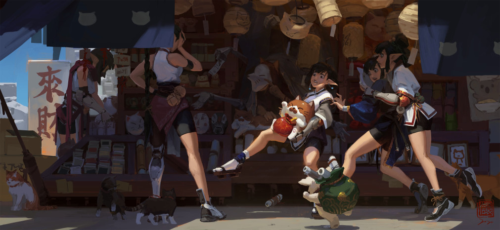
This is when we start making it make sense if that makes sense jeje, we check our perspective, our anatomy and our materials, we use references to see how what we draw actually acts in real life, here i love to use pinterest, only real life photos!
4. Color & Atmosphere
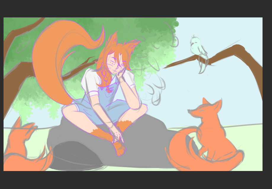
Color sets the mood and emotion — use it strategically to keep coherence and a focal point.
- Block in base colors across the whole canvas first — it gives you the overall tone :3
- Control saturation early. Not every area should be intense — that creates visual noise.
- Use color gradation for atmospheric perspective: distant objects = lower saturation and contrast; near objects = more defined.
- Alternate warm and cool tones to create dynamism and avoid flat, static planes.
- Aim for chromatic harmony so everything feels part of the same environment.
To me there is no better instructor for colors like marco bucci so check his channel!
5. Lighting for Form & Focus
Lighting gives volume, mood, and visual hierarchy.
- Define the light direction first and relate it coherently to the forms.
- Work in layers using blend modes like Overlay and Multiply to build light and shadow without damaging the base color.
- Separate light from shadow clearly to establish contrast.
- Shadows shouldn't be pure black — they should carry color from the environment or reflected light.
- Don't flood every surface with strong light — save the brightest highlights for the main focal points.
- Reflections and volumes reinforce form and add emotion through focused lighting.
My notes here, practice a TON, for me volume is the HARDEST so here i just have a proffesors note/feedback
6. Details, Textures & Final Adjustments
In the final stages, add smaller details and refine edges to boost credibility and impact without overloading the scene.
- Prioritize key areas for detail, leave others softer or simpler to maintain hierarchy.
- Variety in textures and edge control add realism and enrich the atmosphere.
- Subtle color and contrast adjustments can completely transform the overall feel.
- Don't be afraid to change the mood or lighting mid-process if it improves emotional cohesion.
i did not get that far since rendering is something that takes some time
but good resources for rendering are this videos:
That's everything i have in store for you today! ¿did you take any notes? ¿is there any resources you would like to share with the class today? ;D
let's see what we create tomorrow!

Comments